Egypt - 2025
Commercial
Wellness Centre
Subtle acoustic control, ambient lighting, and uncluttered visuals make the space feel restorative. It’s designed for the body, but it speaks to the mind too. Comfort here isn’t an afterthought—it’s the concept itself.
Know More
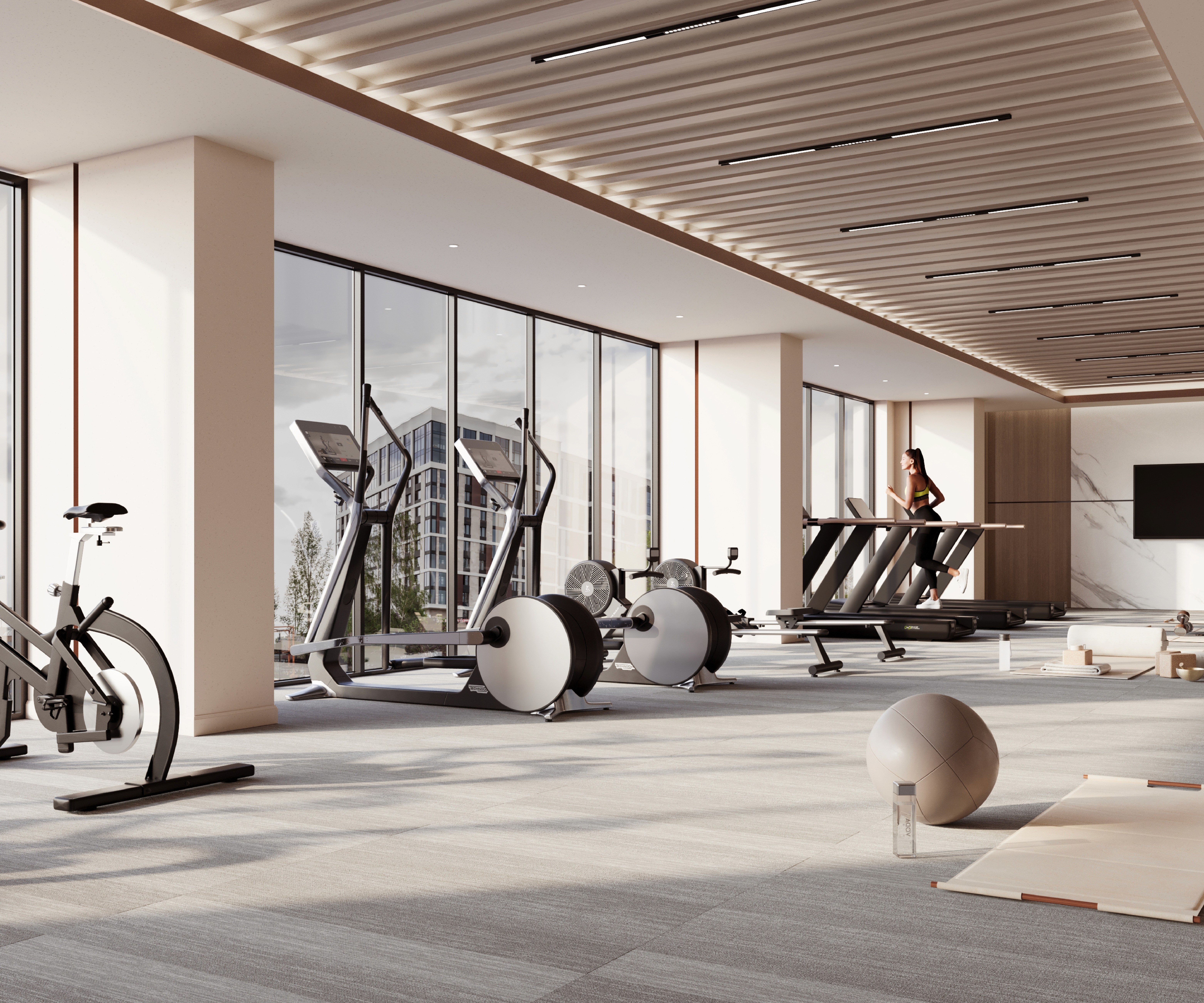
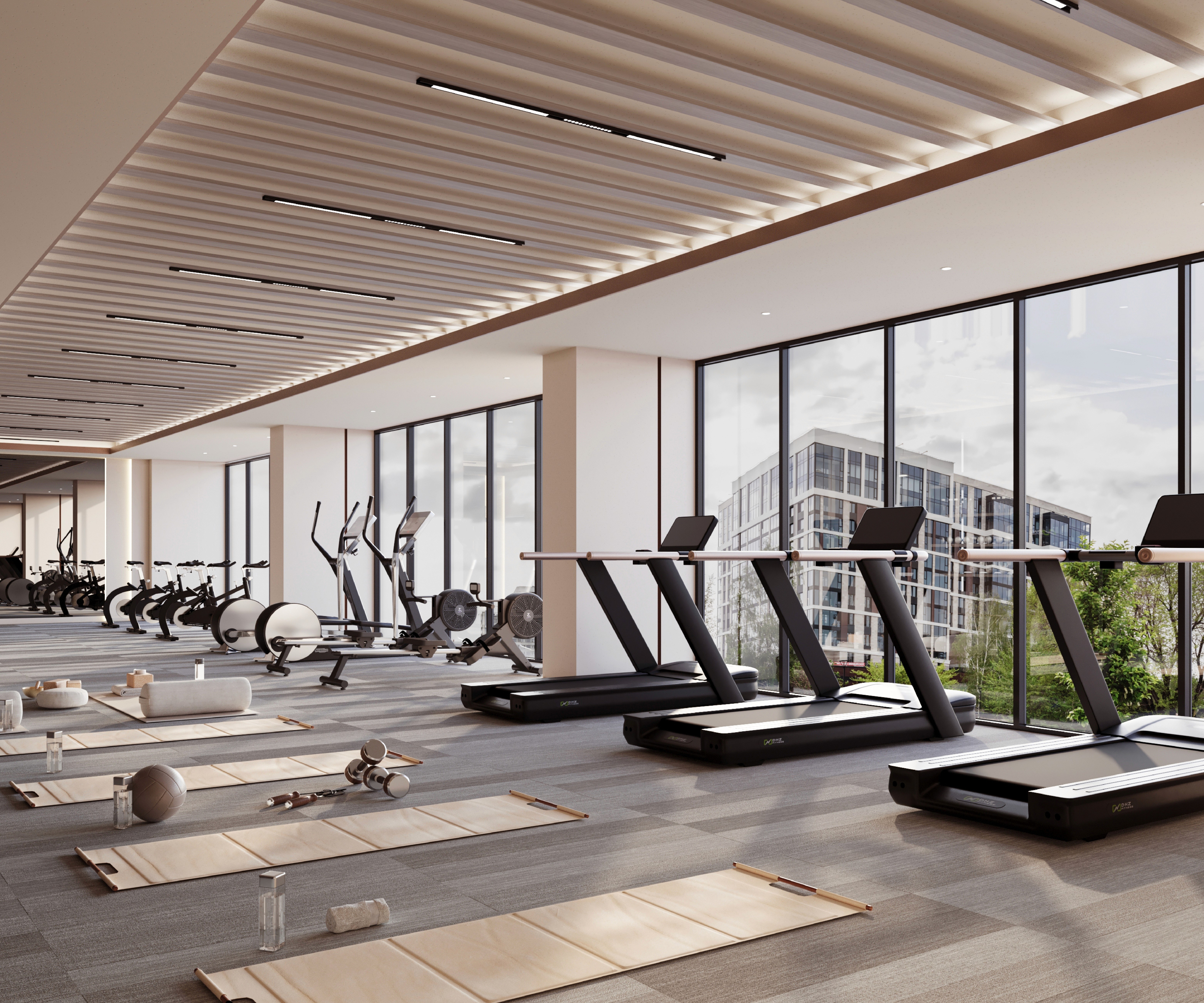
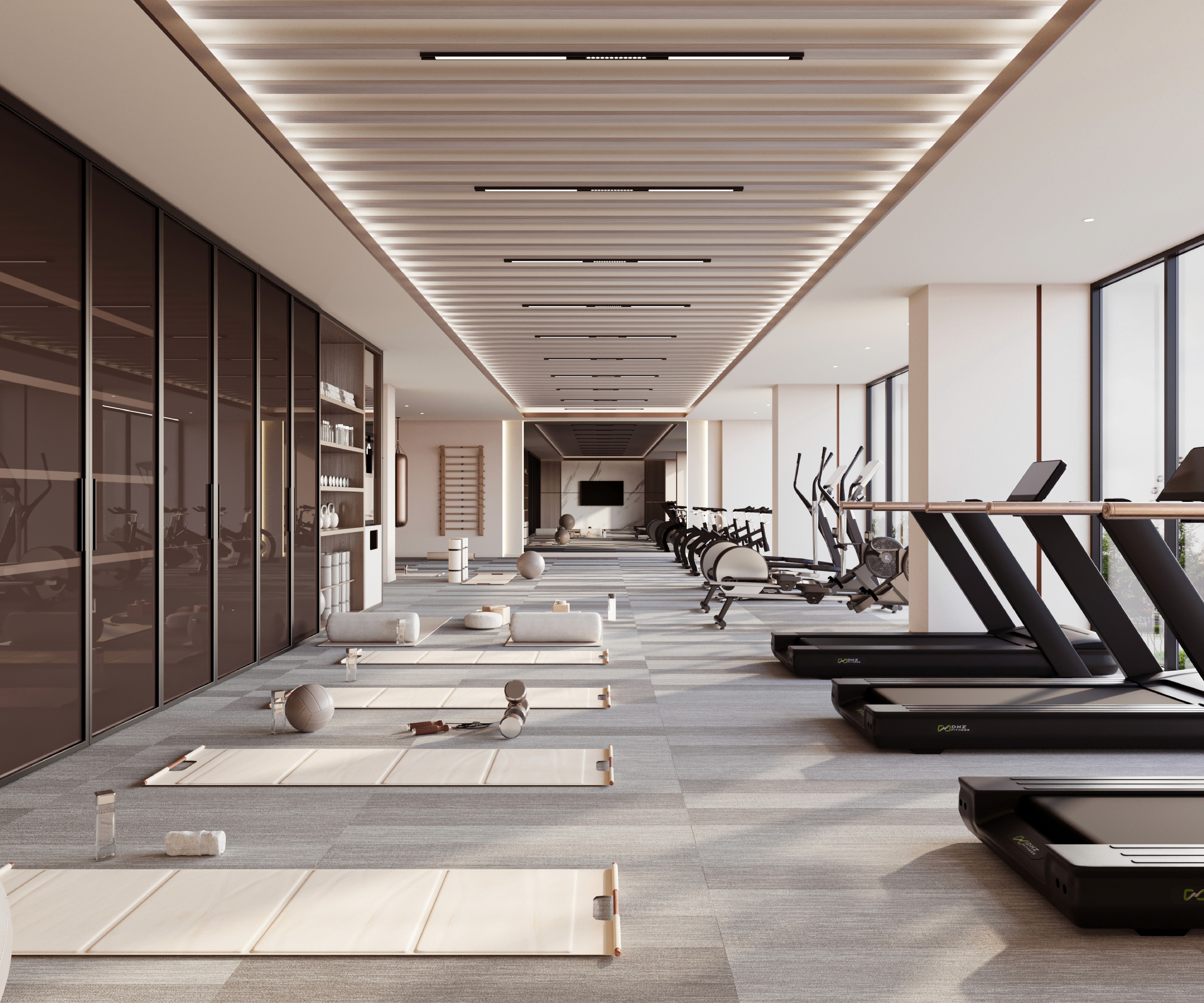
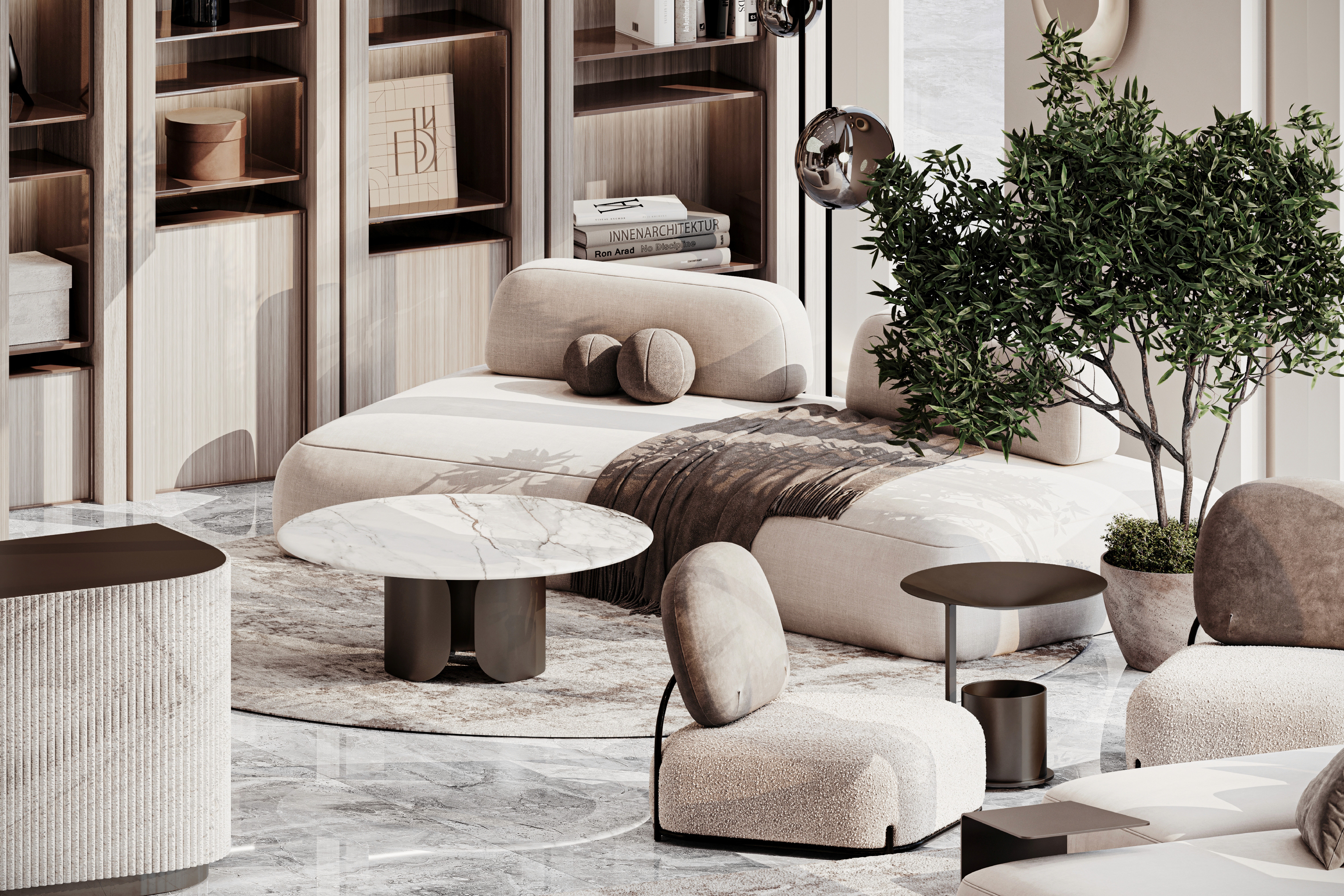
The architecture follows a restrained language where every form serves purpose. Neutral colors—warm beige, off-white, and soft greys—form a visual rhythm that keeps the space grounded and timeless.
Proving that calm design can still be powerful.
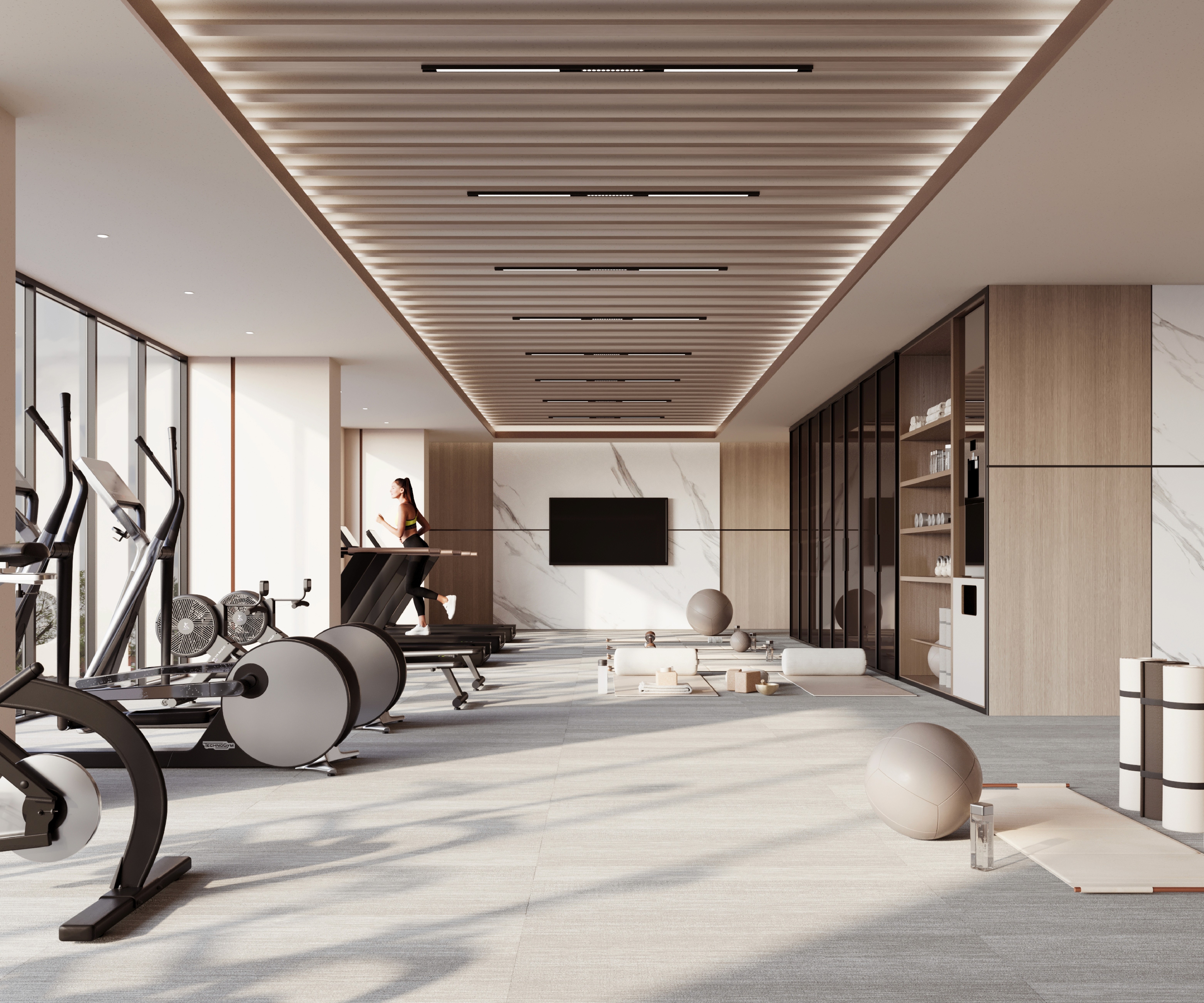
Every machine and mat zone has been placed with precision, allowing fluid movement through the space. Circulation feels natural; no area feels congested or underused. It’s a quiet choreography between design and human flow, making wellness feel effortless rather than chore-like.
Material Warmth
It’s comfort designed with discipline.
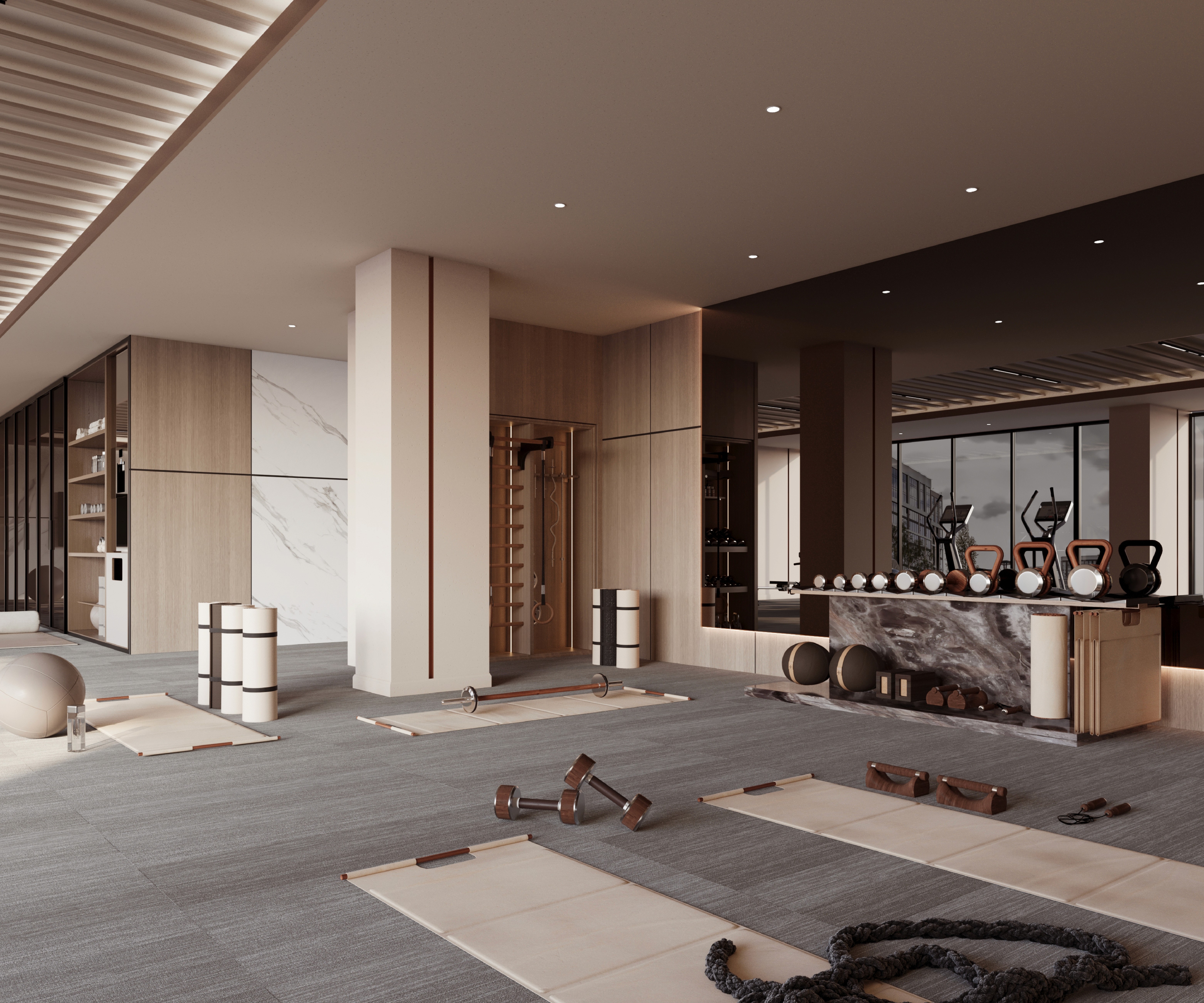
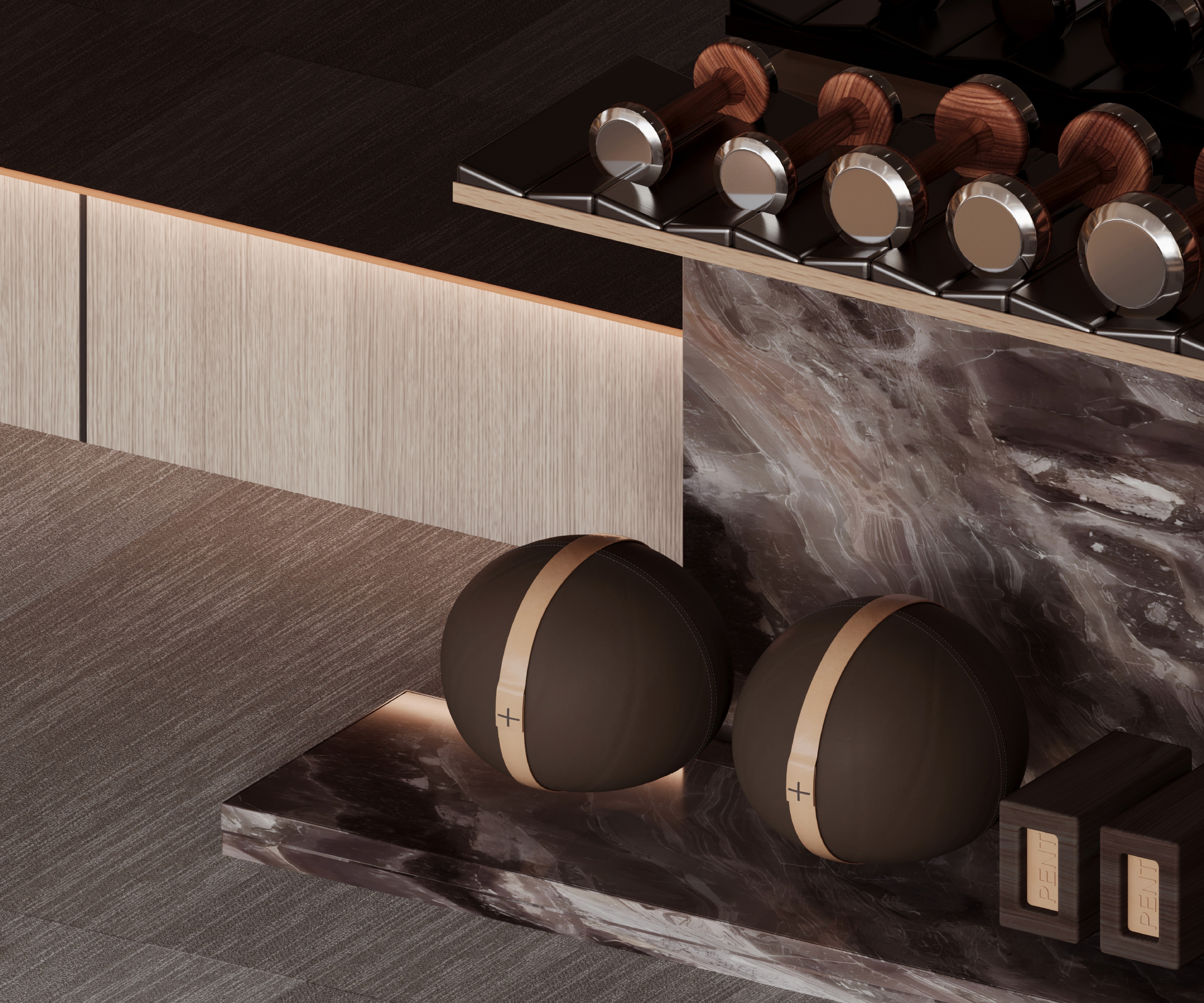
Instead of the usual cold steel and glaring mirrors, the palette embraces tactile richness—soft carpet underfoot, warm wood details, and subtle marble accents. The materials invite touch and slow the pace, reminding users to enjoy presence rather than performance.
Wellness Beyond Fitness
Design whispers the same message: health isn’t about intensity, it’s about harmony.
This isn’t just a place to train—it’s a sanctuary that redefines what wellness means. Meditation corners, stretching zones, and recovery areas all merge into one holistic environment.
Concept
It’s a constant dialogue with daylight and calm
This center treats wellbeing as a full experience—not just physical exercise. The spatial design encourages balance, recovery, and reflection. It’s where movement and mindfulness coexist effortlessly.
More Works
FAQ
01
How is the pricing structure?
02
Are all projects fixed scope?
03
How do we measure success?
04
What do I need to get started?
Egypt - 2025
Commercial
Wellness Centre
Subtle acoustic control, ambient lighting, and uncluttered visuals make the space feel restorative. It’s designed for the body, but it speaks to the mind too. Comfort here isn’t an afterthought—it’s the concept itself.
Know More
The architecture follows a restrained language where every form serves purpose. Neutral colors—warm beige, off-white, and soft greys—form a visual rhythm that keeps the space grounded and timeless.
Proving that calm design can still be powerful.
Every machine and mat zone has been placed with precision, allowing fluid movement through the space. Circulation feels natural; no area feels congested or underused. It’s a quiet choreography between design and human flow, making wellness feel effortless rather than chore-like.
Material Warmth
It’s comfort designed with discipline.
Instead of the usual cold steel and glaring mirrors, the palette embraces tactile richness—soft carpet underfoot, warm wood details, and subtle marble accents. The materials invite touch and slow the pace, reminding users to enjoy presence rather than performance.
Wellness Beyond Fitness
Design whispers the same message: health isn’t about intensity, it’s about harmony.
This isn’t just a place to train—it’s a sanctuary that redefines what wellness means. Meditation corners, stretching zones, and recovery areas all merge into one holistic environment.
Concept
It’s a constant dialogue with daylight and calm
This center treats wellbeing as a full experience—not just physical exercise. The spatial design encourages balance, recovery, and reflection. It’s where movement and mindfulness coexist effortlessly.
More Works
FAQ
01
How is the pricing structure?
02
Are all projects fixed scope?
03
How do we measure success?
04
What do I need to get started?
Egypt - 2025
Commercial
Wellness Centre
Subtle acoustic control, ambient lighting, and uncluttered visuals make the space feel restorative. It’s designed for the body, but it speaks to the mind too. Comfort here isn’t an afterthought—it’s the concept itself.
Know More
The architecture follows a restrained language where every form serves purpose. Neutral colors—warm beige, off-white, and soft greys—form a visual rhythm that keeps the space grounded and timeless.
Proving that calm design can still be powerful.
Every machine and mat zone has been placed with precision, allowing fluid movement through the space. Circulation feels natural; no area feels congested or underused. It’s a quiet choreography between design and human flow, making wellness feel effortless rather than chore-like.
Material Warmth
It’s comfort designed with discipline.
Instead of the usual cold steel and glaring mirrors, the palette embraces tactile richness—soft carpet underfoot, warm wood details, and subtle marble accents. The materials invite touch and slow the pace, reminding users to enjoy presence rather than performance.
Wellness Beyond Fitness
Design whispers the same message: health isn’t about intensity, it’s about harmony.
This isn’t just a place to train—it’s a sanctuary that redefines what wellness means. Meditation corners, stretching zones, and recovery areas all merge into one holistic environment.
Concept
It’s a constant dialogue with daylight and calm
This center treats wellbeing as a full experience—not just physical exercise. The spatial design encourages balance, recovery, and reflection. It’s where movement and mindfulness coexist effortlessly.
More Works
FAQ
How is the pricing structure?
Are all projects fixed scope?
How do we measure success?
What do I need to get started?